Real estate company Shea Properties reached out to the creative team to develop marketing materials for events they are hosting.
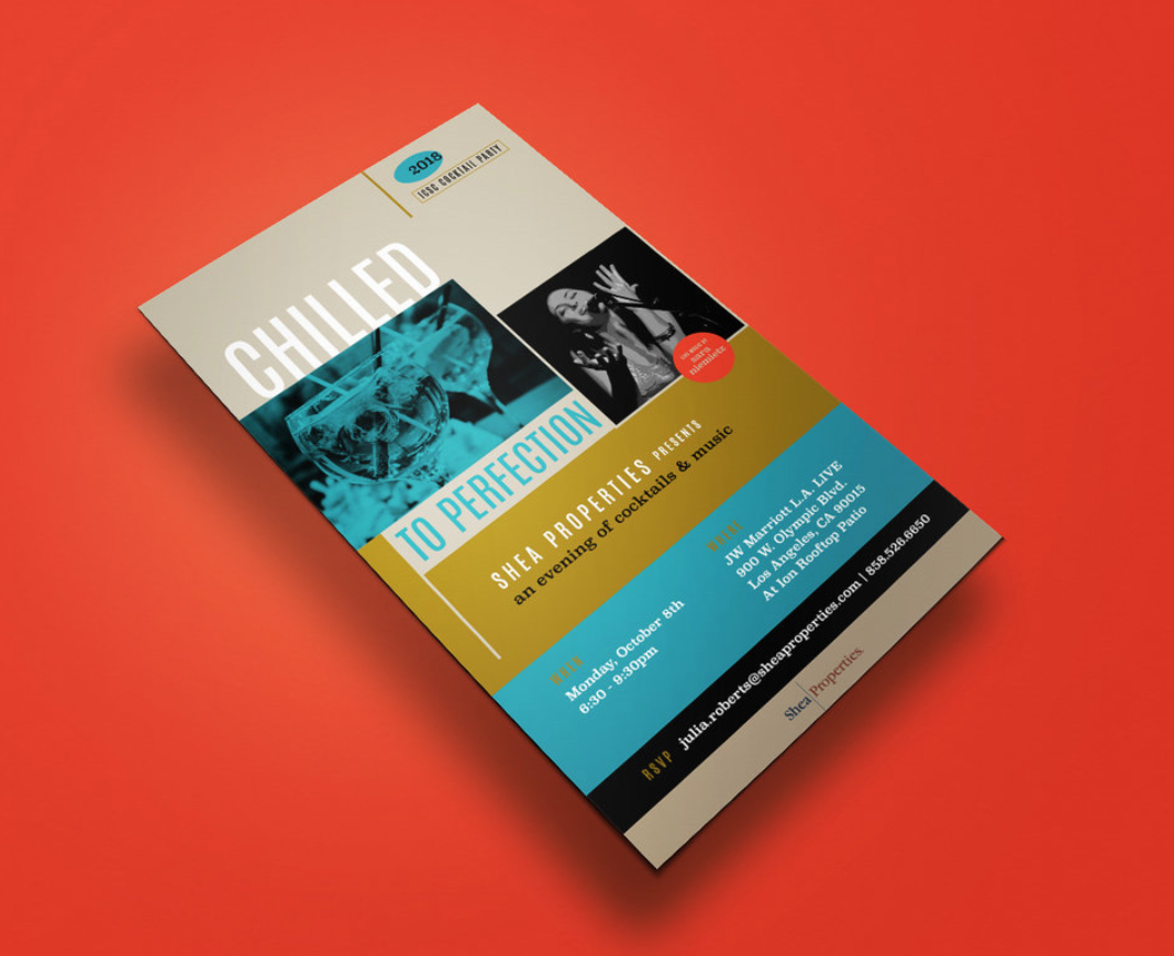
Shea Properties will host their annual cocktail party for the International Council of Shopping Centers, featuring a performance from jazz singer Sara Niemietz. Inspired by Niemietz’ musical style, the Jovenville team designed an email invitation for the party using stylish fonts and a sophisticated, bluesy color palette.
Because Shea Properties liked the design of the email invitation, they then asked the designers to create a poster based on it for a concert series called Hot August Nights, which will take place every weekend of August at their retail locations in Dana Point and Laguna Niguel. The poster has a similar look and feel, but with a reimagined layout that suits the content.
“These two projects were very rewarding for our team to work on,” said Joven Orozco, creative director behind the project. “I think we can be proud of the work we did to make Shea Properties stand out.”
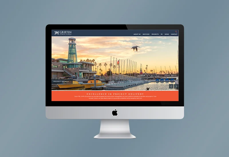
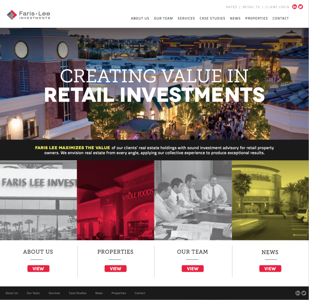
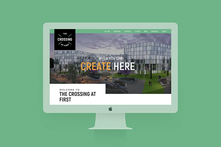
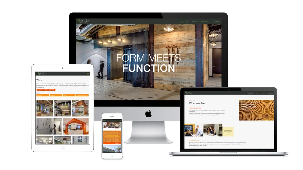
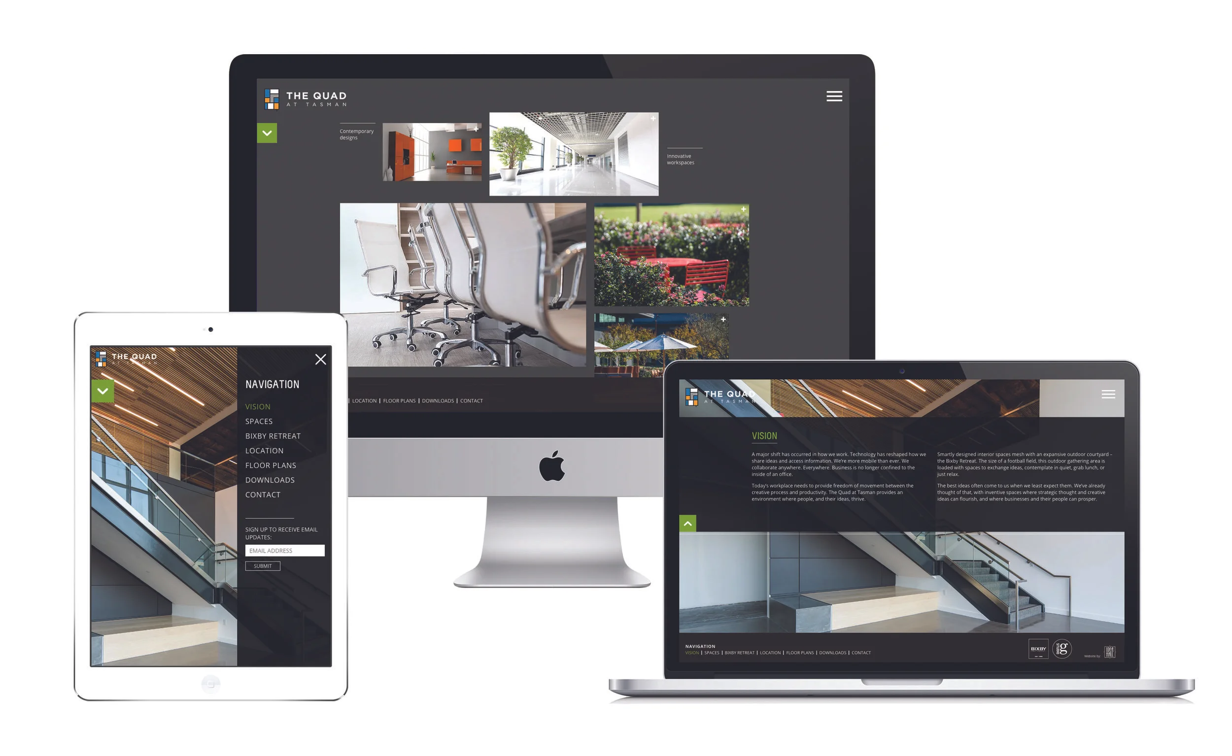
When leading design and construction management service provider Griffin Structures needed a complete website overhaul, they sought out the Jovenville team to provide exactly what they were looking for.
Griffin Structures wanted to use their website to reinforce their company-wide value proposition and demonstrate their commitment to their clients. The result is a fully responsive site that is compatible across multiple browsers and platforms, and allows the company to share news about its staff and current projects via a blog.
As a result of the redesigned website, Griffin Structures now has a website with a sophisticated appeal that accurately reflects their brand and positions them as an industry leader.
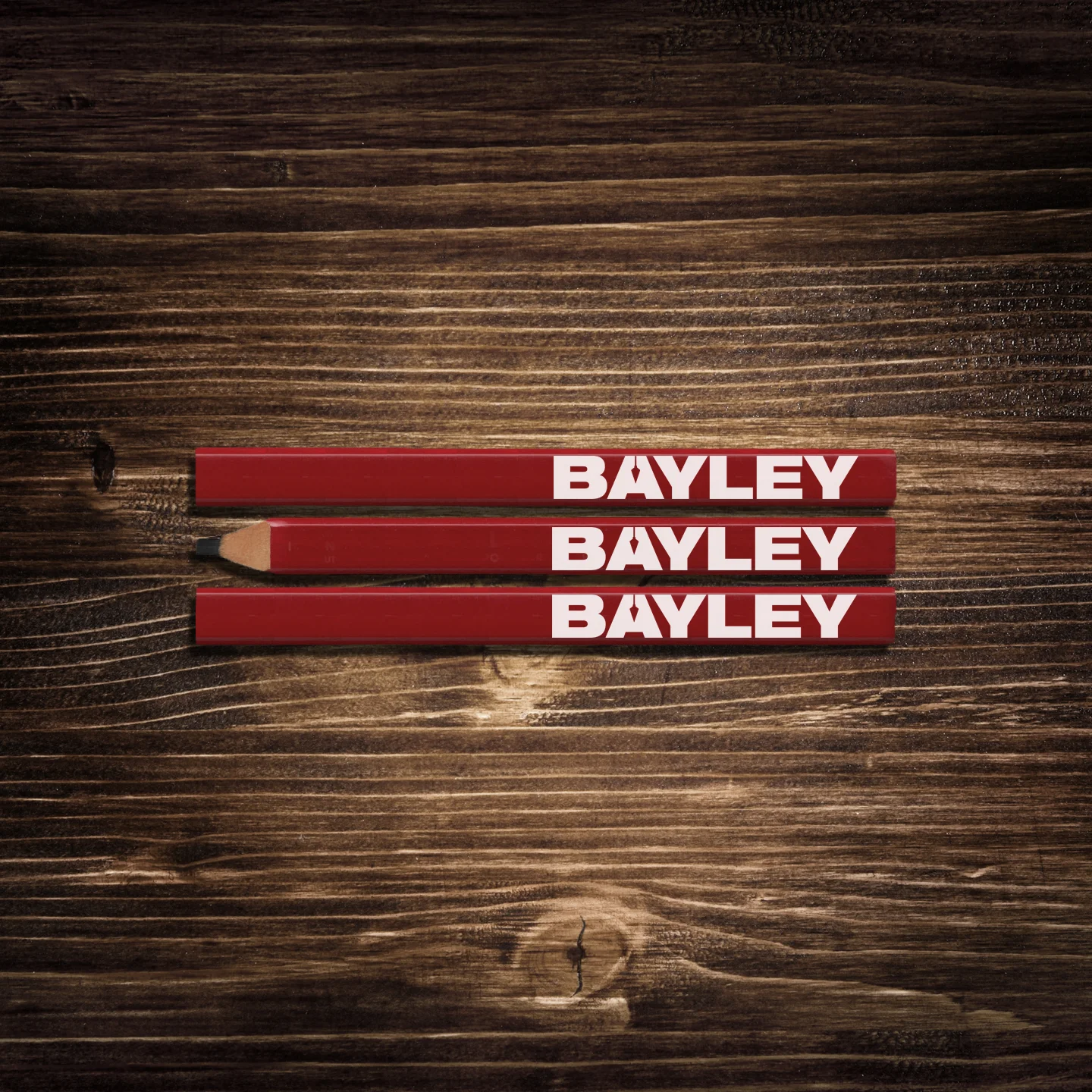
Bayley is particularly proud of the 2016 branding refresh, which demonstrates its unique value proposition while not losing sight of the company's heritage and pride in its talented staff and family-oriented culture. Bayley wanted to keep its "plumb bob" symbol to recognize the past, but modernized the design to be more precise and legible. The company is committed to providing clients with projects that meet the highest standards of quality, safety and integrity. Bayley Construction strives to be a trusted partner through effective communication and collaboration.
"One thing that is certain in our industry, and lives, is change," said Steve Grasso, President of Bayley. "This past year, we took an introspective look at our organization, the changing market landscape and our current marketing efforts and decided to 'refresh' our brand at Bayley."
We were responsible for the naming, branding and marketing a Holiday in into The Hotel Hanford. A new high end independent boutique for corporate travelers. After the corporate identity was created the sales team needed a sales kit that reflected the new brand aesthetic.
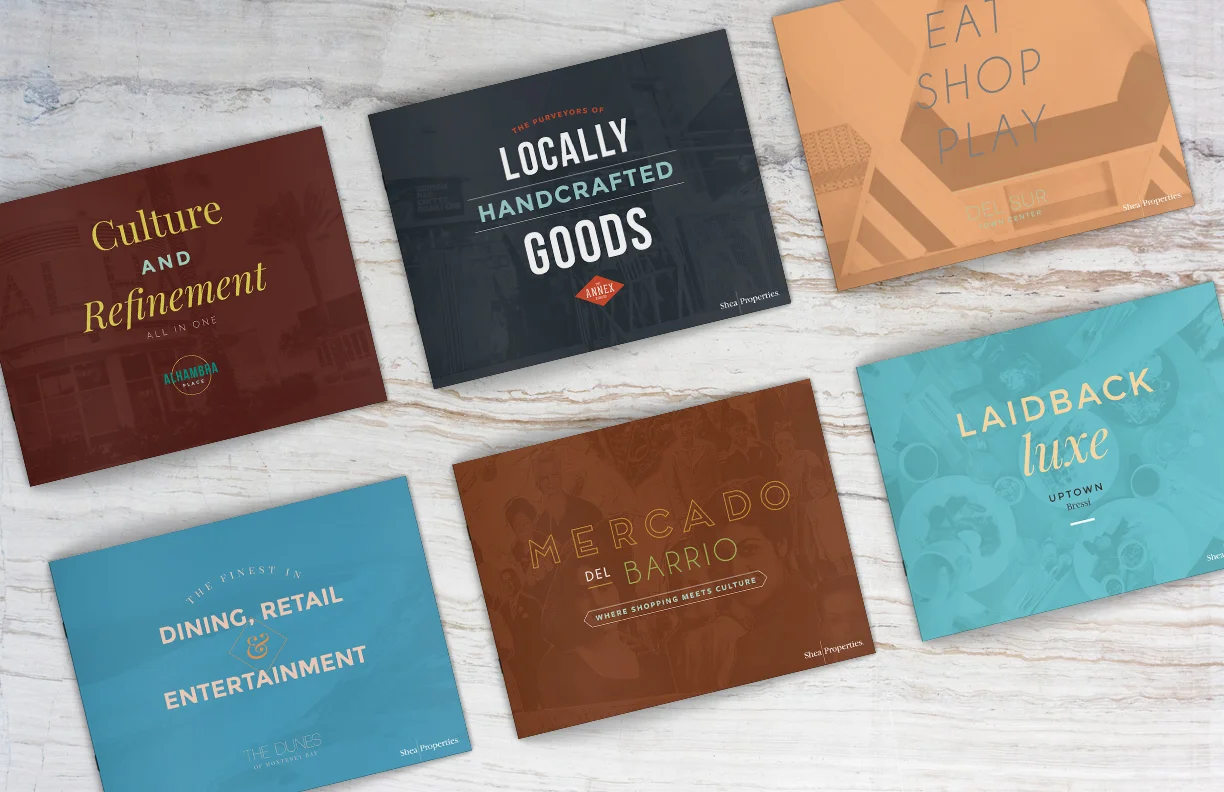
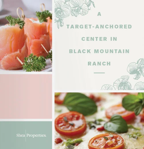
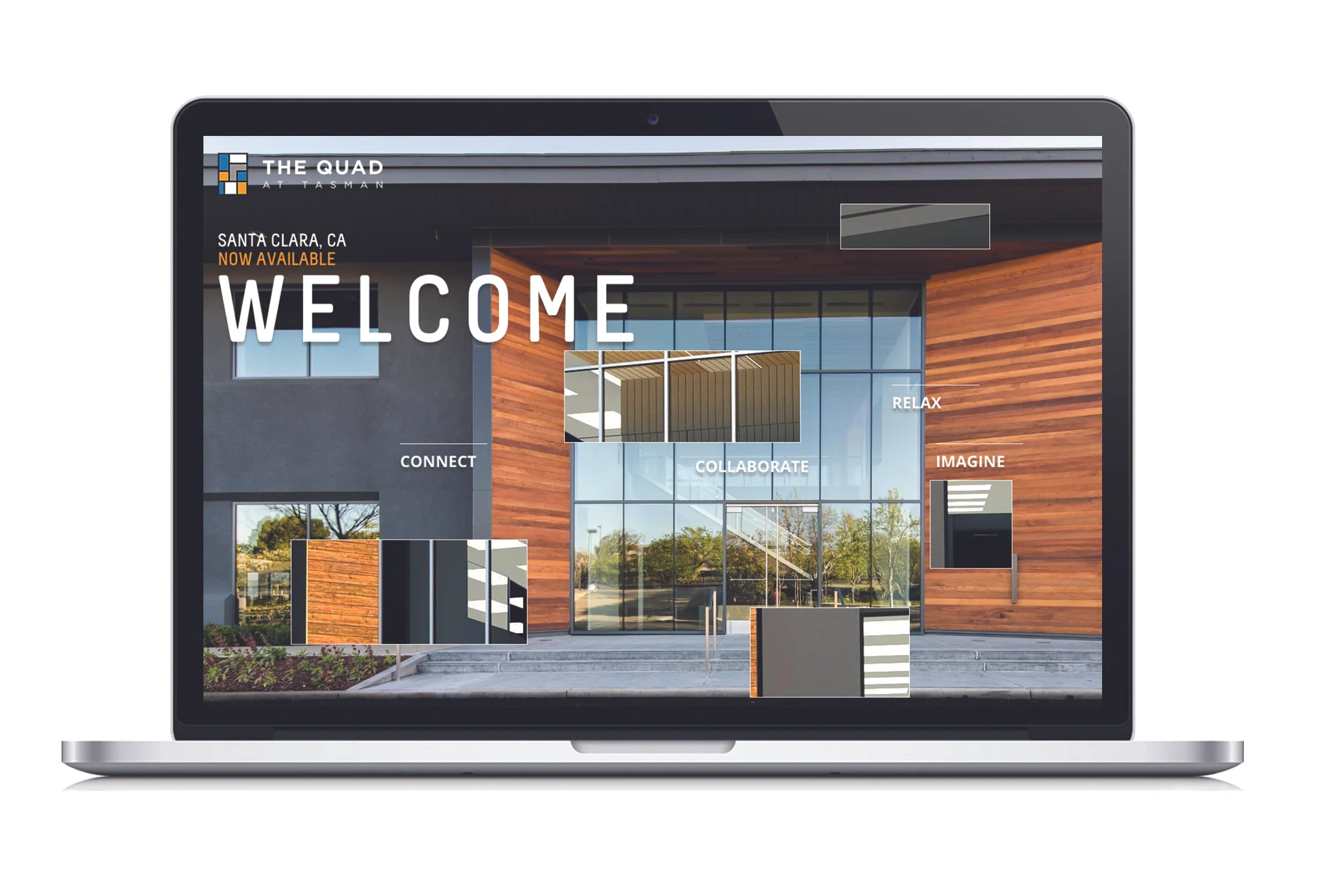
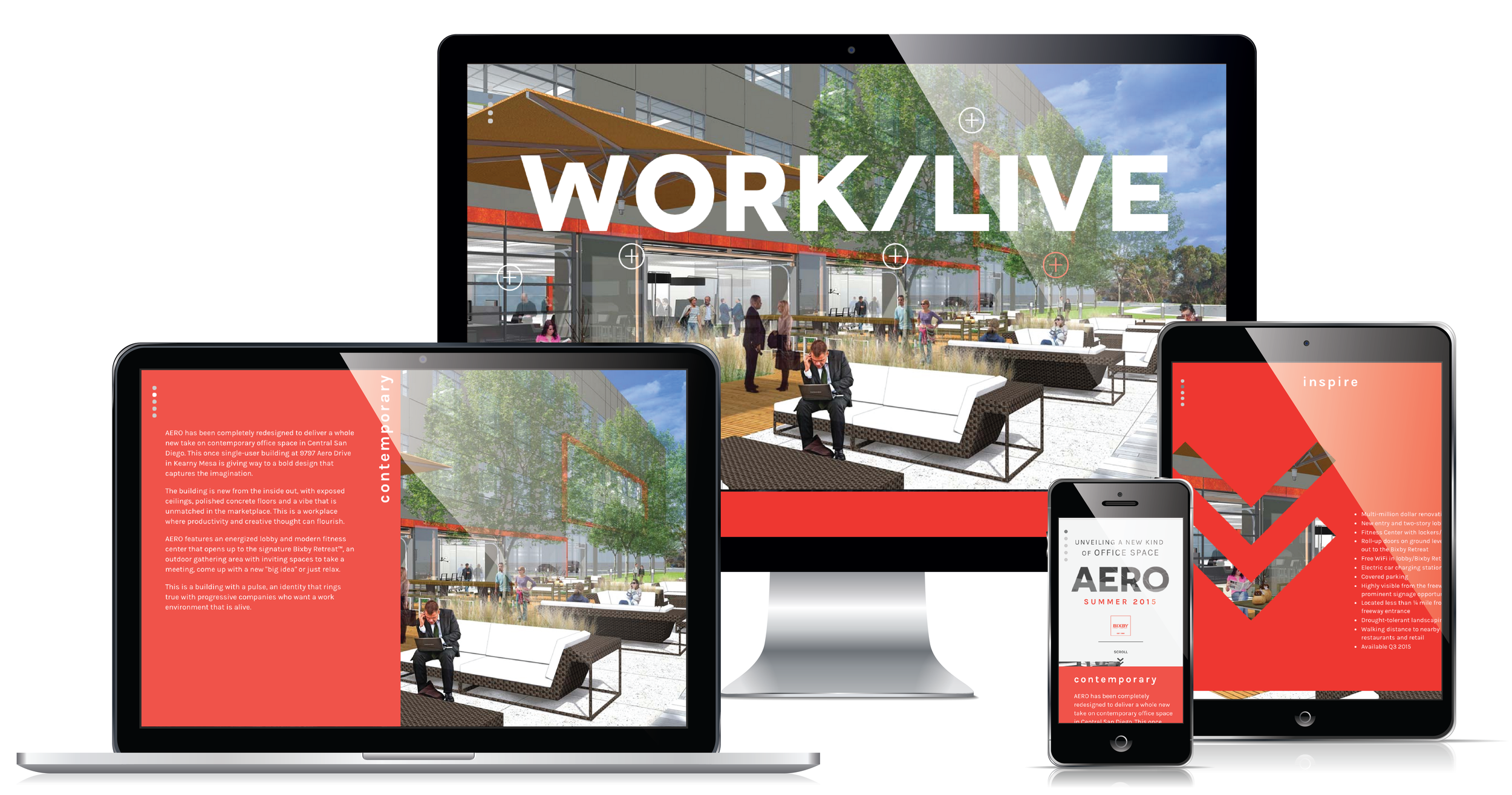
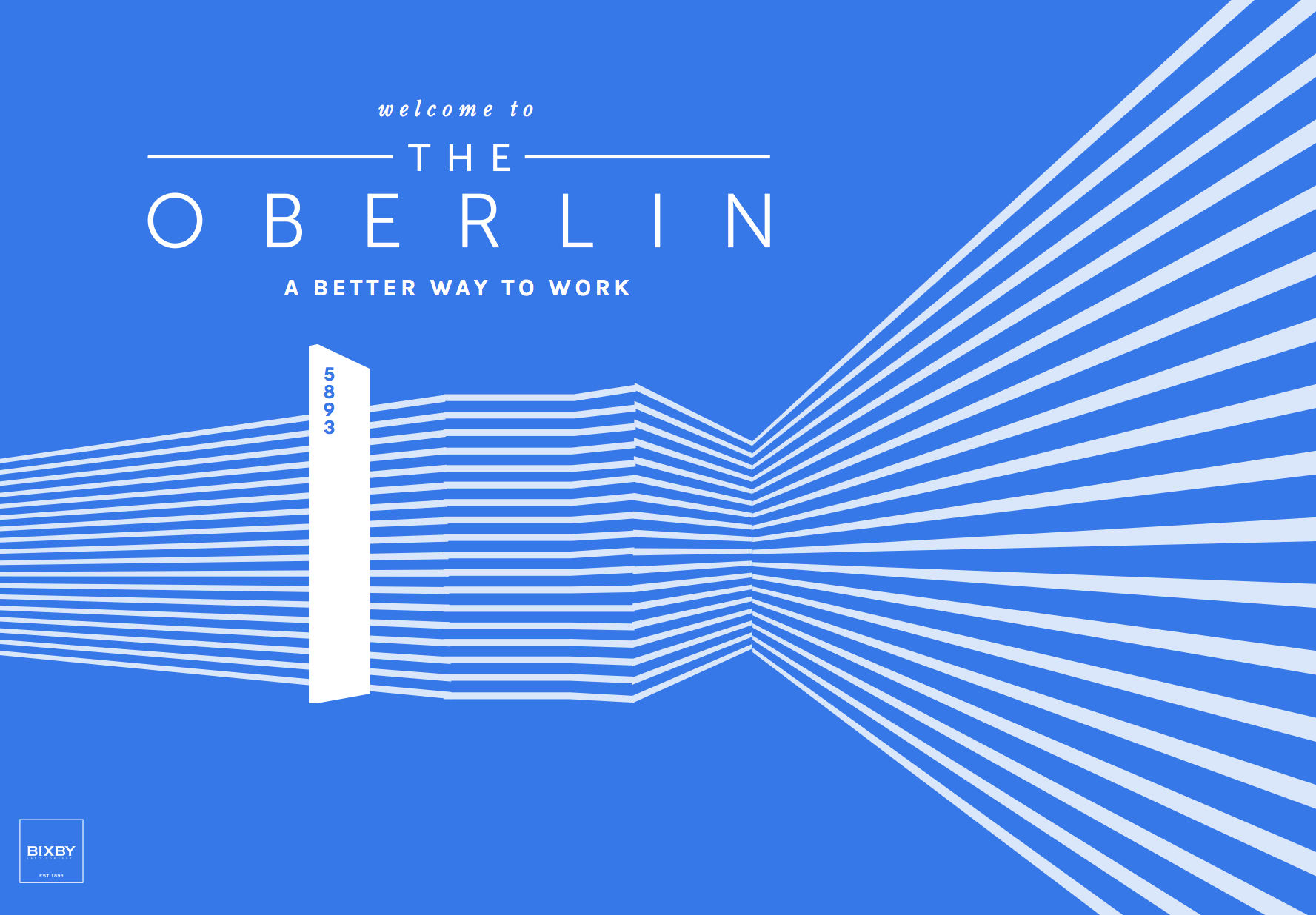
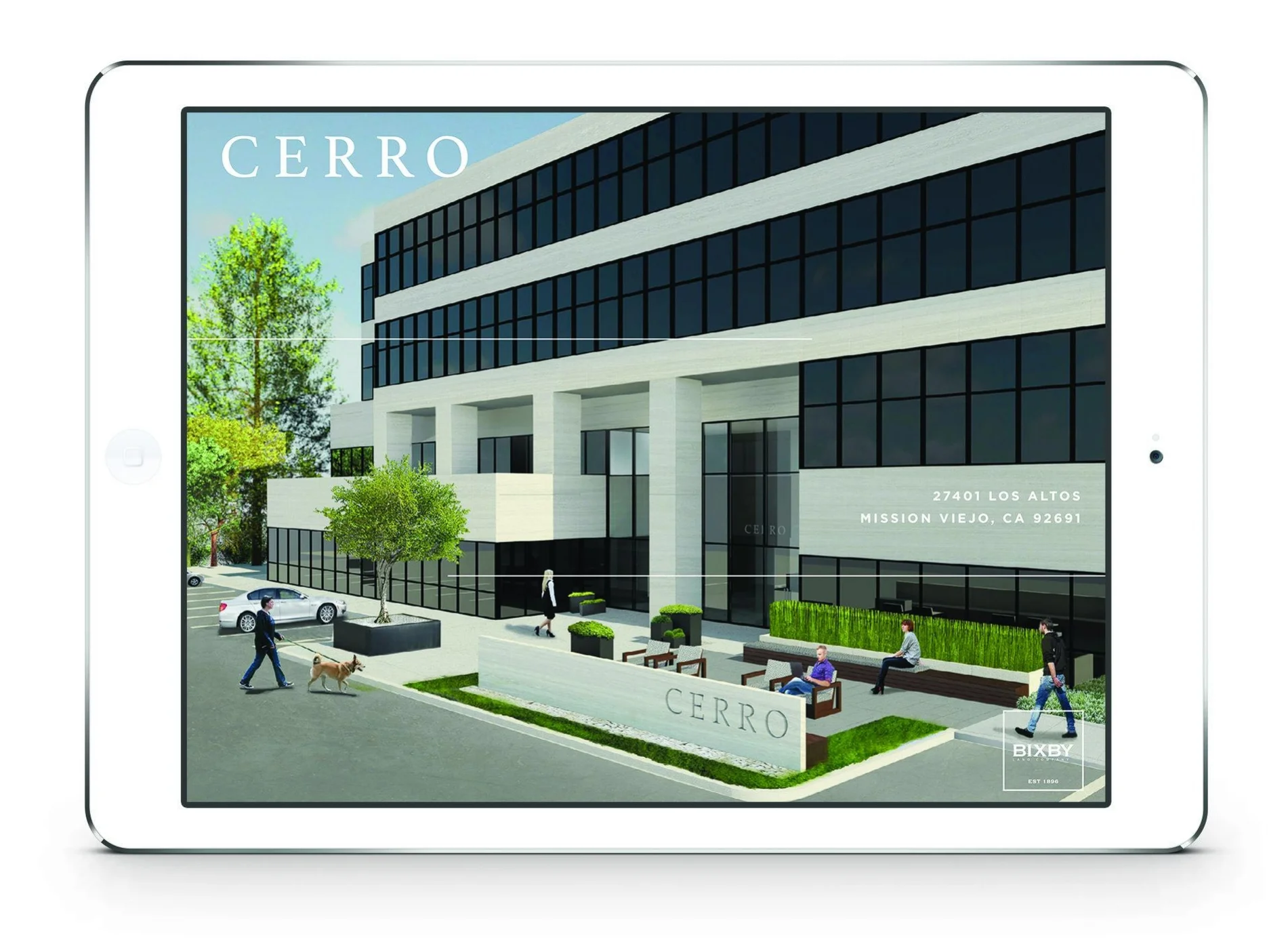
Shea Properties has a portfolio of seven properties, each with its own personality. They needed a unique brochure to showcase each property’s distinctive characteristics.
For this project, the Jovenville design team was responsible for developing and delivering a set of brochures that captures the vibe of the full range of properties.
Each brochure has a trendy, contemporary look and feel that showcases the properties’ offerings using thoughtful typography, carefully selected color schemes and photography – such as lifestyle images – to demonstrate a wide range of retailers, restaurants and features.
We designed a high-quality brochure intended to appeal to potential retail tenants of The Collection shopping center, located in the heart of West Ventura County. Jovenville was responsible for the discovery, design, development, and delivery of The Collection Brochure for its client, Shea Properties. The artwork reflects the center’s highly artistic, young, and modern brand appeal. The brochure’s contents visualized the center’s strategic location, retail space architecture, as well as its buzz-worthy appeal to consumers. Light, bright pastel colors were used to create a simple and easy-to-read elegant design.
Hotel Angeleno, a 209 room independent boutique hotel in Los Angeles, was about to undertake a multimillion dollar guest room renovation in January 2016. With that, the hotel had decided to refresh and reposition the brand to a new younger audience. We enlisted the services of Jovenville as the branding, design and concepts were aligned with the Hotel Angelenos vision and strategies.
Working with Jovenville and the creative team was a refreshing exercise in that the Jovenville team was able to connect with the vision immediately and deliver a myriad of fresh designs and concepts as it related to all touchpoints of the hotel. The reconception of the hotel logo, its brand colors and also the creation of its 'We are NOT Square' tagline have elevated the brand and brought the contemporary, clean and vibrant look we were looking for. Brand identity, DND signage, key system, sales kits are all part of the comprehensive work Jovenville has provided for Hotel Angeleno. We will continue to work with Jovenville as new projects come to light.
“The feedback from our partners and client base has been tremendous as they look the new look and feel of the brand."
- Director of Sales & Marketing, Hotel Angeleno
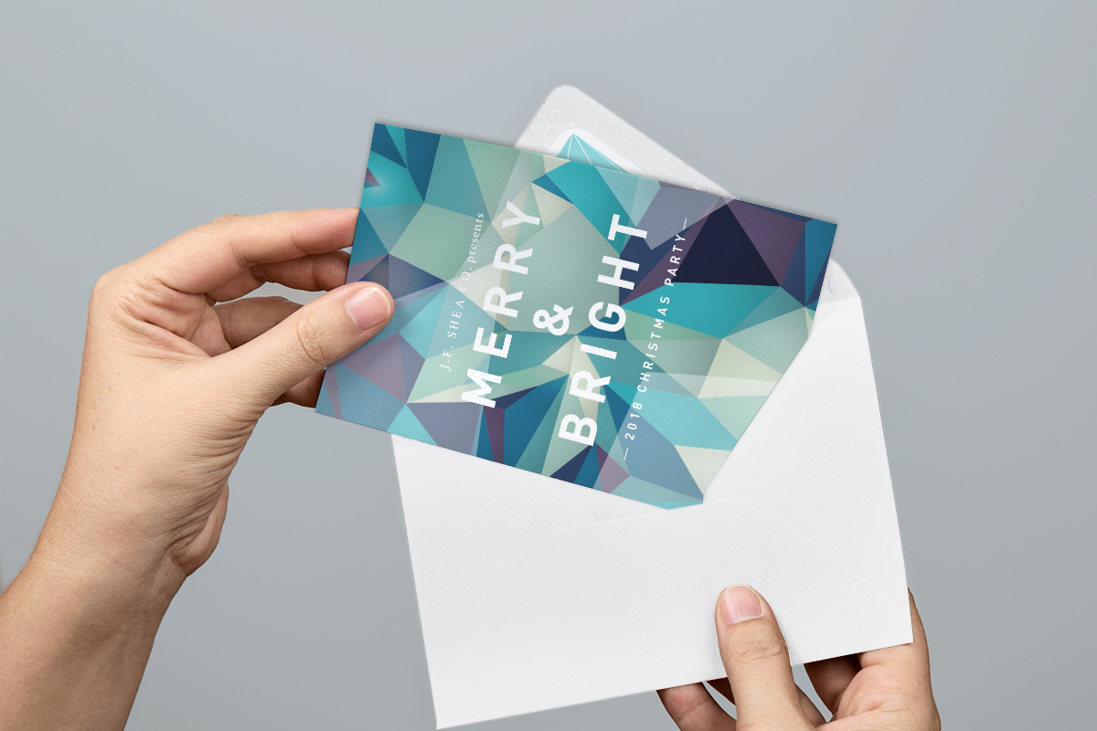
Shea Properties, a diversified real estate company, reached out to the Jovenville design team to commission an invitation package for their annual holiday party, which will also coincide with the company’s 60th anniversary celebration.
As part of the planning for this large company party that includes all divisions, Shea Properties asked Jovenville to develop an elegant invitation package that includes a subtle nod to their milestone anniversary. Since the 60th is the diamond anniversary, the invitation had a diamond theme. The collateral items for this project included an invitation, envelope, RSVP card and envelope and two drink tickets.
Jovenville’s designers used a winter-inspired color palette to encompass both the pure white light associated with a diamond, as well as abstract shapes and lines that evoke both a diamond and a Christmas tree. Though the diamond theme is understated on the card design, both envelopes feature a hidden diamond inside the interior of the envelope to continue the theme. The typography is sophisticated and clean to maintain a stylish and glamorous consistency.